Trends move fast. A print that feels fresh in March can look tired by September, and most of us have a wardrobe corner where those pieces go to be ignored. But some prints don't follow that arc. You pull them out three years later, and they still feel like you, not like a photo of a season you've moved past.
The difference usually isn't restraint. Plenty of loud, maximalist prints hold up fine, while some “safe” patterns date almost immediately. What separates the two is whether the print has its own point of view, or is just borrowing one from the current moment.
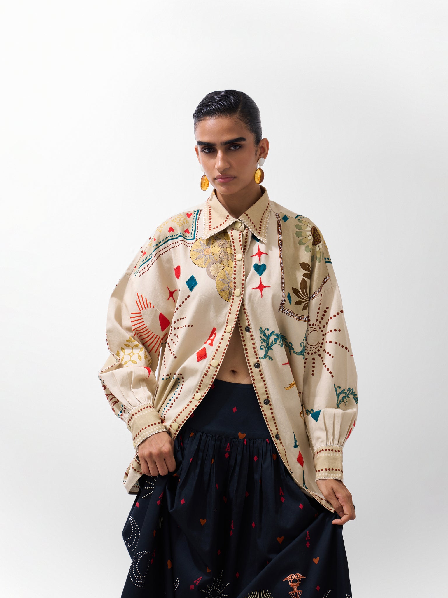
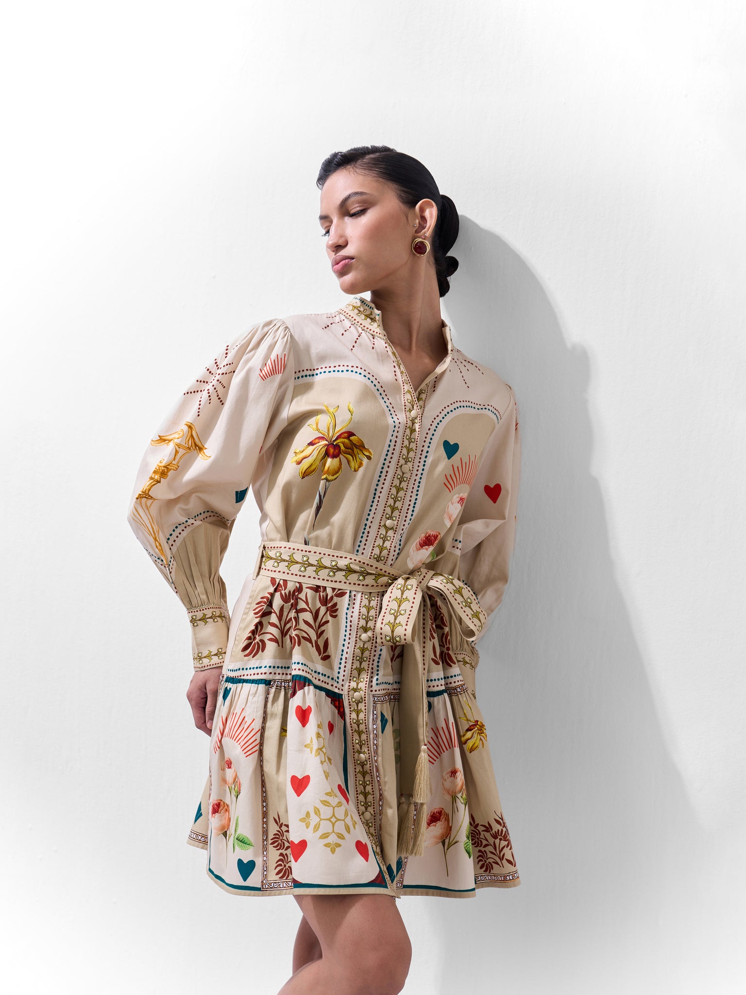
Hand-drawn prints tend to land on the right side of that line. They carry the artist's hand - the pressure of a line, a slightly uneven curve, a mark that wasn't run through a symmetry tool and that kind of individuality doesn't expire the way a trend does. At indian resort wear brand NOIB, this design philosophy travels well beyond one wardrobe or one region - prints built from illustration first, trend second (if at all).
What Makes a Fashion Print Timeless?
It has character beyond the trend
Timeless doesn't mean minimal. A bold, maximalist print can outlast a “quiet luxury” basic if the print itself has a distinct visual identity. This composition feels intentional rather than pulled off a trend board, and an artistic voice you can recognize even out of context.
It leaves room for personal style
A print you can only wear one way has a short shelf life. The ones that stick around are flexible enough to become a standout dress one week and a toned-down separate the next - styled up, styled down, layered differently depending on the season, without ever feeling like it's fighting you.
It feels designed, not decorated
There's a real difference between printing a pattern onto a garment and building a garment around a print. The first treats the print as an afterthought. The second treats it as part of the piece's identity - the reason the piece exists in the first place.
Why Hand-Drawn Prints Feel Different
The human mark in every line
Hand-drawn work carries irregularity by nature - a line that wavers slightly, a shape that isn't perfectly repeated, brushwork with actual texture. In algorithmically generated or overly symmetrical patterns, that irregularity gets smoothed out. In hand-drawn prints, it's the whole point. The imperfection is what makes it read as made by someone, not generated for everyone.
From illustration to fabric
The process behind a hand-drawn print isn't complicated to describe, even if it takes real skill to execute: an idea becomes a sketch, the sketch becomes a full illustration, the illustration becomes a repeat-ready print, and the print becomes fabric. Each stage keeps something of the artist's original hand intact - which is a very different starting point than opening a pattern-generation tool and picking a preset.
Why imperfection can create longevity
It's tempting to assume “timeless” means “perfectly symmetrical,” but that's not quite right. Mechanical precision can look clinical, even soulless. A hand-drawn print keeps the small irregularities that make it feel personal rather than manufactured — and personal is harder to date than polished, because it was never trying to match a moment in the first place.
Hand-Drawn Prints vs. Trend-Led Patterns
Not every trend-led print goes stale - some hold up fine. But a print built to chase a current aesthetic is, by definition, tied to that aesthetic. When the aesthetic moves on, the print's relevance moves with it.
| Hand-Drawn Design |
Trend-Led Pattern |
| Built around artistic expression |
Often built around current aesthetics |
| Has a distinctive visual identity |
Closely tied to a particular trend |
| Can evolve through styling |
Often reads as tied to one season |
| Carries a sense of individuality |
Tends to follow broader visual movements |
| Part of the garment's identity |
Often functions mainly as decoration |
When a Print Becomes Part of a Brand's Identity
A print starts to feel like more than a surface treatment when it repeats certain choices on purpose - a recurring visual language, a particular color relationship, a consistent illustration style, a way of scaling motifs against the body, a relationship between the print and the cut of the garment itself.
Put those choices together across a few collections, and you get something recognizable not because it's loud, but because it's consistent. That's the space NOIB has been building in: prints that don't just decorate a garment but say something about who made it.
The Storytelling Power of Hand-Drawn Prints
Prints can carry a sense of place
Illustration lends itself to reference in a way flat pattern-making often doesn't. A hand-drawn print can nod to a landscape, a particular flower, a memory of travel, a piece of architecture, a cultural motif - without needing a caption to explain itself.
Why narrative makes a print more memorable
People remember prints that make them feel something, not just prints that were on-trend at the time of purchase. A print that evokes a place or a mood gives you a reason to keep reaching for it long after the original context has faded.
NOIB's Approach to Prints: Designing Beyond the Season
NOIB's prints start as illustrations, not as patterns retrofitted to fit a collection brief. That ordering matters — it means the print drives the garment's identity rather than the other way around, and it's part of why the pieces are built to be worn well past a single season, cut against contemporary silhouettes rather than costume-y shapes.
The Archives: A Conversation Between Past and Present
AW'26 - The Archives leans into that idea directly, using archive-inspired print language filtered through a current lens. Four prints anchor the collection, and each one brings something different to the table:
- Old Rose leans into floral character with a softer, more romantic hand.
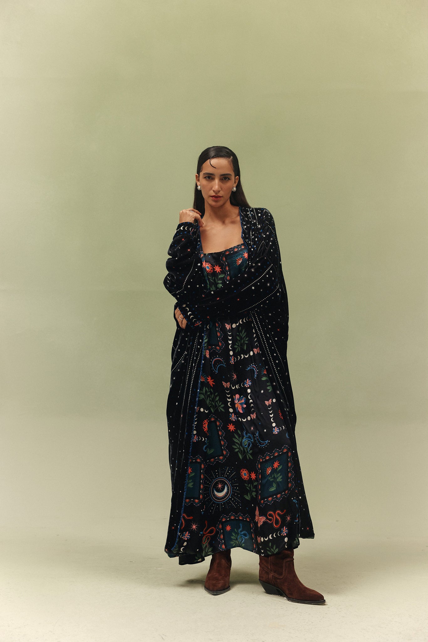
- Nocturnal Jungle takes a darker, more atmospheric read on nature - less garden, more night walk.
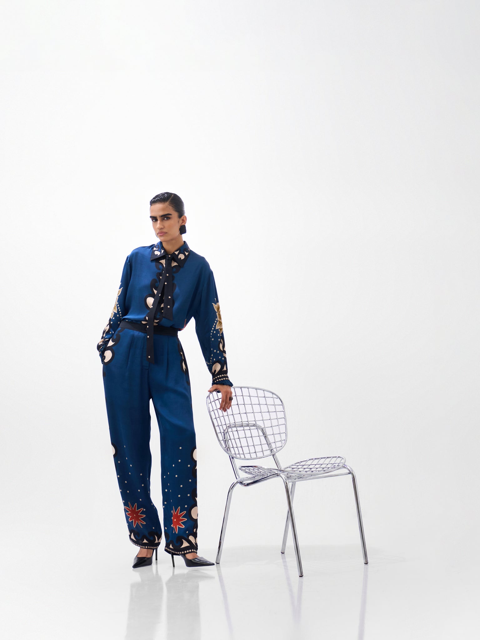
- Mosaic works through graphic structure, building visual rhythm out of repeated geometric form.
- Postcards & Petals carries a playful, almost narrative quality, like something collected rather than designed.
How to Style Timeless Prints Without Making Them Feel Dated
- Let the print lead. When a garment is already doing visual work, keep accessories and footwear relatively restrained. Competing for attention just muddies the look.
- Style printed separates each time differently. A printed shirt with plain trousers reads completely differently from the same shirt worn as part of a co-ord, or layered under a solid outer piece. Same garment, several looks.
- Mix prints with modern silhouettes. A bold, expressive print paired with a current cut feels contemporary.
- Build around prints, not trends. Buy the piece because you actually connect with it, not because a particular pattern is having a moment. That's usually the difference between something that gets worn for years and something that gets worn twice.
Why Timeless Prints Belong in a More Considered Wardrobe
Choosing pieces for their design and craftsmanship, rather than their trend cycle, tends to produce a wardrobe you actually reach for. It's less about chasing whatever's current and more about picking things you have a real connection to - clothing you return to rather than quietly replace every few months.
To be clear: a hand-drawn print isn't automatically a sustainable one. The technique speaks to design longevity and individuality, not to a garment's environmental footprint. Those are separate conversations, and it's worth not conflating them.
From Seasonal Trend to Personal Signature
Most style journeys follow a rough arc — you try a trend, you experiment with it, you figure out what actually works for you, and eventually a few pieces stop being “the thing everyone's wearing” and start being yours. A strong print is often what tips a piece from the first category into the second.
A print doesn't need to be quiet to be timeless. It needs a point of view.
Conclusion
Timeless design isn't about playing it safe. It's about having something to say. Hand-drawn prints carry individuality, storytelling, and visual character in a hard way to replicate through trend-chasing alone, which is exactly why they tend to outlast the season they were made for. NOIB's approach, print-led from the sketch stage onward, is built around that same idea: clothing that holds up because it was never just decoration to begin with.
FAQs
Q1. What makes a print timeless?
A timeless print has a distinctive character that doesn't depend entirely on a current trend, an intentional composition, room for different styling approaches, and a design that feels like part of the garment's identity rather than a decoration added on top.
Q2. Why are hand-drawn prints different from digital patterns?
The difference is mostly in process and character, not in output. Hand-drawn prints originate from an artist's sketch and carry natural irregularities in line and form, but that doesn't mean digitally printed fabric can't reproduce genuinely hand-drawn artwork. The print's origin as illustration is what gives it its character, regardless of how it's ultimately printed onto fabric.
Q3. Are bold prints timeless?
Not automatically, and not never. Boldness alone doesn't decide longevity of a print's composition, artistic character, and versatility matter more than how loud it is. Quiet prints can date just as fast as bold ones if they don't have a real point of view.